


Blue Grit (and Red, and Orange, and...)
Color and landscape, whether actual or imagined, in the work of Leon Berkowitz, Wayson R. Jones, and many more
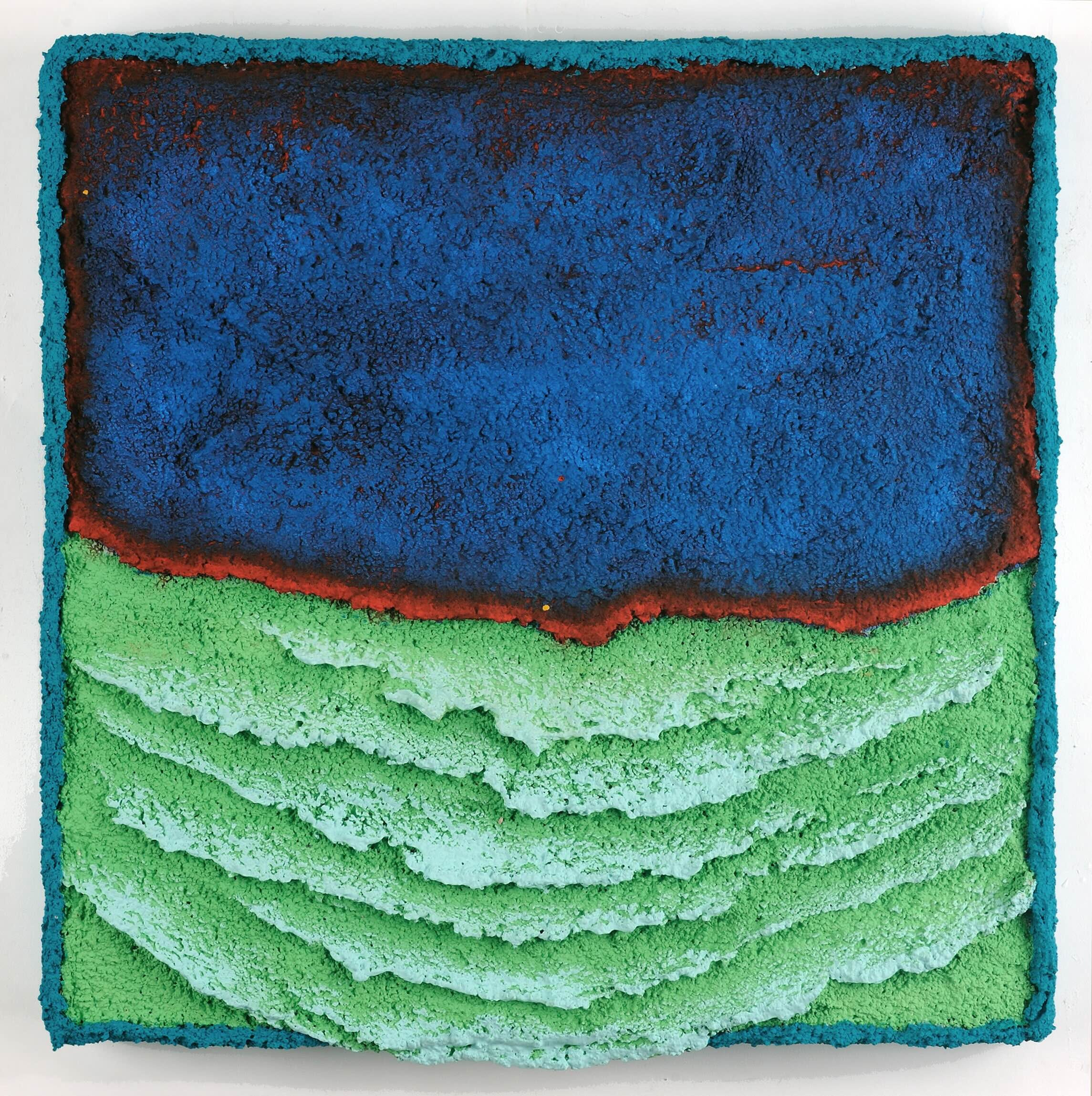
Wayson R. Jones, “Menthol Blues Migration” (Hemphill Artworks)
WHILE LEON BERKOWITZ AND WAYSON R. JONES CAN EACH BE DESCRIBED as color field painters, their ideas of a field are rather different. Berkowitz (1911-1987) made airy paintings whose surfaces are utterly flat, yet seem to glow from some submerged light source. Jones has long made earthy pictures whose facades are chunky and heavily worked; his early work was monochromatic, but it now appears to overflow, sometimes literally, with color.
The two D.C. artists's styles are juxtaposed at Hemphill Artworks, where five Berkowitz paintings occupy the back gallery. Made between 1972 and 1979, the pictures are characteristically luminous and immaculate, and vast enough to engulf the viewer. Most feature incandescent orange-red cores flanked by blues, but the cooler "Unities 47" is just as mesmerizing. Its aquatic tones shift only slightly in intensity, giving a sense of placid waters.
The Jones paintings are made of pumice gel that's shaped and painted with acrylic or Flashe. One set is gently striated and tinted in close and often pastel hues, to gentle effect. Another group employs textured waves that become more agitated as they descend, so the lowest portion appears to drip off the canvas. The latter series is blue at the top, with the lower crests usually highlighted in orange or red, so that they might be lava rather than ocean.
Four paintings have less regular patterning. "Clouds Are Bright and Somehow Grainy" is raked like the gravel in a Zen dry garden, but its curving colors are nothing like the gray-on-gray of Japanese stonescapes. Even brighter is "Hot Stepper," in which the orange-red top level looks as if it's been corroded by acid, allowing glimpses of a lime-green underpinning. This picture is where Jones's style comes closest to Berkowitz's. Both use layered colors to envision a great beyond.
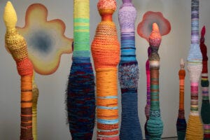
Detail from installation of Hyunsuk Erickson’s "Thinggy of Their Town" (IA&A at Hillyer)
VISUALLY IF NOT CONCEPTUALLY, there's a strong link between Jones's paintings and the fabric-covered sculptures of Hyunsuk Erickson. The Seoul-born local artist's work has been included in several area group shows, often outdoor ones, but now she has a room of her own. "Thinggy of Their Town" fills IA&A at Hillyer's largest gallery with Erickson's trademark spires -- she calls them "thingumabobs" -- which are made of wood, plastic, or ceramic and dressed with colorful woven and embroidered materials.
Whether this profusion is termed a town or a jungle, the sculptures gain potency from being grouped tightly together. In addition to planting a thicket of thingumabobs, Erickson has deployed others that protrude like tendrils from a wall or the ceiling, so the room seems to be a single organism. She's also affixed rainbow-colored blobs to the walls, where they resemble flowers or suns. The striped and shaggy upright pillars, which bulge, twist, and sometimes curve at the top like dental implements, suggest cacti or buttes. Such entities recall backdrops from a prematurely psychedelic mid-20th-century cartoons or children's books.
Erickson has something else in mind, however. She explains her work as signifying the intersection of the United States and South Korea and reflecting "the contrasting consumption patterns of my two cultures." The exuberance of these sculptures, in other words, is not necessarily a good thing. But Erickson constructs her big and bold American landscape from recycled materials, thus preserving a tradition of Korean frugality.

Details of work by Lesley Clarke and Hernan Murno (Park View Gallery)
THE TWO ARTISTS EXHIBITING TOGETHER AT GLEN ECHO'S PARK VIEW GALLERY, Lesley Clarke and Hernan Murno, have very different styles. Yet their themes overlap congenially, as is suggested by their show's title, "Transcending Time: Exploring the Beauty of Landscapes and Landmarks." Both painters conjure lost worlds, although Clarke's inspiration is her own native country, and Murno's decidedly isn't.
Clarke's part-abstract landscapes are based on sketches and photos of Scotland, where she was raised. The local painter works mostly in the colors of earth, grass, and sky, set off by areas of white that hint at gaps in memory. Imperfect recollection is also suggested by the heavily worked surfaces of the acrylic and encaustic paintings, which are streaked, cracked, and blobbed, and sometimes embedded with small metallic found objects. Or the rough textures might echo the harshness of Clarke's chosen locations, mostly in Scotland's craggy Highlands or along its rugged coastlines.
The sense of loss in Clarke's pictures is conveyed in part by the ghostly buildings that appear, just barely, in some of her compositions. Abandoned cottages nestle or float in the terrain, their fragility perhaps denoting the depopulation of these regions, or emotional distance from them. Clarke's paintings evoke the powerful allure of a homeland, but they're far from homey.
The buildings in Murno's paintings are much grander, but just as ruined. The Argentina-born local artist looks to classical Greece and Rome, and fills his pictures with the remains of temples, coliseums, and other structures that remain imposing a millennium or more after their last use. He depicts these edifices not in the neutral tones of marble and granite, but in bright reds and with strong color contrasts. The hot hues render the long-vanished classical world vivid and insistent.
Murno's acrylic-and-ink pictures convey his fascination with Greco-Roman heritage, but also his restless stylistic imagination. Fluid gestures contrast the orderly architectural forms, and shards of pulverized glass are embedded into some of the works. One painting on an aluminum panel leaves a circle of metal unpainted so as to resemble a silvery moon. Such inventive details are as distinctive as Murno's ancient subjects.
Katherine Tzu Lan Mann, “Swimming’ (Morton Fine Art)
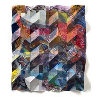
AS IMPROVISATIONAL AS THEY ARE ARCHETYPAL, the artworks in "Patterns, Patchwork, Origami: Sculptural and Relief Paintings" deploy circles, triangles, and rectangles. But the geometric forms are often rendered in materials that are worn, warped, or intentionally damaged. The six artists remake as much as they make.
This Gallery B pop-up is a showcase for six artists represented locally by Morton Fine Art, whose main location is open only by appointment. Two of the contributors are literally patchwork artists: Arizona's Kesha Bruce stitches jazzy quilt-like collages made of found fabrics, and Kenya-based Prina Shah sometimes incorporates pieces of old saris into mandala-like pieces in which text and color circle each other in concentric rings. Brooklyn's Hiromitsu Kuroo works with wood, but he paints and bleaches the fan-like arrangements in a manner inspired by the fabric industry of his Yokohama childhood.
Katherine Tzu Lan Mann's collage-paintings are usually more freeform, but this selection does include a piece executed by the local artist on folded paper, which overlays a sort of grid on the intuitive composition. A blue-heavy painting by New York's Andrei Petrov contains dozens of panels, some of which include representational imagery. Jenny Wu, also local, is sort of a pattern painter -- except that her vibrant pictures are actually sculptures, assembled of dozens of dots and dashes of hardened and cut latex paint. Her technique may be a sort of quilting, but it's a method all her own.
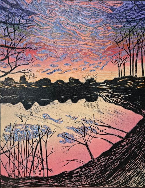
Catherine Rubin, “Lake Light” (Washington Printmakers Gallery)
FOR CATHERINE RUBIN, REDUCTION WOODBLOCK PRINTING is not merely a process; it's also a metaphor. In her Washington Printmakers Gallery show, "The Texture of Time," nature scenes are rendered with woodblocks that are recut after each color impression, so that returning to an earlier step is impossible. "The block is gradually destroyed as the print is created," the local artist writes. "This reflects both the nature of our experience and lends itself to the capture of multiple moments expressed as a single image."
If that suggests a somewhat chaotic vision, Rubin's prints are in fact neatly composed, although often energized by unnaturalistic colors. Most of her pictures are nature scenes that evoke timelessness rather than the pileup of events the artist describes in her statement. One exception is "Touch Rocks," a dynamically vertical rock-climbing vignette that leads the eye skyward. Rubin also dabbles in the supernatural by depicting such mythic creatures as the chimera and the phoenix.
Most often, Rubin's prints are serene. Bold reds may define a mountain or a sky, but they're set off by the cool blues of sky or water. The artist is just as deft with gentler colors, as she demonstrates with "Lake Light," bathed in the rosiness of dawn or twilight. It's a moment that in real life would last just an instant, but here is elegantly frozen in time.
Leon Berkowitz and Wayson R. Jones
Through April 26 at Hemphill Artworks, 434 K St. NW. hemphillfinearts.com. 202-234-5601.
Hyunsuk Erickson: Thinggy of Their Town
Through April 27 at IA&A at Hillyer, 9 Hillyer Court NW. athillyer.org. 202-338-0680.
Lesley Clarke and Hernan Murno: Transcending Time: Exploring the Beauty of Landscapes and Landmarks
Through April 27 at Park View Gallery, Glen Echo Park, 7300 MacArthur Blvd., Glen Echo. 301-634-2274.
Patterns, Patchwork, Origami: Sculptural and Relief Paintings
Through April 27 at Gallery B, 7700 Wisconsin Ave. #E, Bethesda. mortonfineart.com. 202-628-2787.
Catherine Rubin: The Texture of Time
Through April 27 at Washington Printmakers Gallery, 1675 Wisconsin Ave NW. washingtonprintmakers.com. 202-669-1497.